Friday, 19 December 2014

Psycho-Analysis and Freud in Animation


Common misconceptions

-it's a mish mash of psychology (behaviour) and psychiatry (mental illness)

-it's all about sex. 

Iceberg metaphor. 
Consciousness above surface.
Unconsciousness below surface. 
90% is below the surface. 

Consciousness- made up of the 'ego'- the side we show the world. 

Our 'super-ego' is what lies beneath the surface. 

The 'ID' is what drives our sexual desires and impulse decisions and instinctual desires. 

Psycho-analysis is interested in art & design & media because it explores the deep desires. 

Wednesday, 12 November 2014

The Meaning of Style

Hebidge, D (1979) 'Subculture: The Meaning of Style'
- "Youth cultural styles begin by issuing symbolic challenges, but they must end by establishing new conventions; by creating new commodities, new industries, or rejuvenating old ones."

- The reason people form and become part of subcultures is because the ideas of the mainstream/everyday values do not appeal to that particular person. They are symbolic challenges to the norm, thus making them exciting. 
Unfortunately they often end up turning into commodities and industries to be sold back to the people rebelling against the system. They get sucked into the mainstream.

- As soon as the media gets a hold of the subcultures ideas and styles, and writes about it, whether in a positive or negative way, it becomes popular and the subculture becomes marketable and mainstream. 

- Punk was about rewriting the rules of what it was to be a man, how to make music, how to dress, and what it was to be British and , in particular, from London. It was a refusal to conform.
It got bad press and was thought to be bad people, no parent wanted their child to be a punk. It was quite frowned upon.

- Eventually, subcultures get sucked back into the mainstream as their idea of rebellion is being sold back to them.

INCORPORATION- How mainstream sucks subcultures back in.
IDEOLOGICAL FORM- The system makes the subcultures ideas and style seem ridiculous and irrelevant. Eg. selling fake mohawks for fancy dress, making fun of the style. 
COMMODITY FORM- The system starts selling things aimed at the subcultures style , making the subculture part of the mainstream and stops it rebelling.

Tuesday, 14 October 2014

The Gaze and the Media

In 1972 John Berger said that women are forced to carry an image of themselves in their heads. They regard themselves as being looked at so maybe make more of an effort and put themselves out there.

This image is called Vanity and it is by Hans Menling.
It seems as though we are given permission to look at this womans body because she is looking at herself in a mirror. This breaks eye contact with the audience.


Another example of this is Alexandre Cabanels birth of venus.
In this image, her arm is over a lot of her face. 
Again, this means she isn't looking back which means we aren't being challenged and she is giving us permission to look at her body.


This is the same kind of image but with photography. It was used as an for YSL's Opium advertisement in the 90's. The nature of this photo was considered far too sexualised to be out for the general public to see. Partly the hand on the breast which actually covers her modesty and partly because the attention is drawn to her body.


However, when they turned the image on its side, the focus became more on the face so this was considered okay to use. 


In the below images (left: Titans venus of vurbino-1538, right: Monet-Olympia 1863) they are quite similar in composition. However there are subtle differences. On the left the woman is very relaxed with a soft look of her face whereas the right is more rigid, also pay attention to the hand positioning. The left is just draped over herself whereas the right is more definitely placed as if she does not want that part of her body on display. Both images are like you have special access to their bed chambers but one is more inviting than the other.


The next images (Ingres Le grand odalisque 1814 and the edited version for a poster for the Guemilla Girls) They used this image to put on their poster advertising that less than 5% of the artists in the modern art section were women but 85% of the nudes are female. Basically, they're asking why women are mostly the ones being sexualised? 

However, this poster was seen as being too sexually suggestive with the fan in her hand so it got pulled.


This is Coward.R the look from 1984. In this image there is a barely dressed woman in the city streets and everyone around her is just going about their daily business as if she wasn't there. This shows the normalisation of nudity. In this image the camera is an extension of the male gaze.


This image of Eva Herzigova was on a billboard and ended up stopping traffic because people were slowing down to look at it. That shows that sex sells because people want to look at it.


This advertisement for Dolce and Gabbanas male underwear line still had nudity in the ad but the way the models are all looking directly at the camera is challenging the viewer so it makes it not as okay to look and you pay more attention to their faces because they're connecting with you.


Images such as this which is a celebrity caught unaware by Cindy Sherman are liked because everyone wants an insight into a celebrities life and want to see more of them. The sunglasses here are used much like the mirror at the beginning of the post and the arm over the face. It's to distance the gaze from the viewer to make it okay to look at her.

An example of people wanting to see more from celebrities is big brother. people just sit there and watch other people. But the women on the show are very aware they are being watched and almost perform to it like they are very aware of how they look.


Your gaze hits the side of my face by Barbra Cruger has like a double meaning. Its like yes you look at the side of her face but also the word 'hits' could mean like you literally hit the side of her face like this whole thing with the media and portrayal of women is damaging her. 


Tracey Emin challenges this kind of portrayal of women with this photo showing that money is more important-thats what people want, thats what they see in this photo. Not the fact its between her legs. Another way you can look at the photo is that a womans body makes money.


Saturday, 22 March 2014

Post Modernism

- 'Postmodernism Term applied to a wide range of cultural analysis and production since the early 1970s. Whilst there are different attitudes to what postmodernism is, it is generally referred to as a significant shift in attitude away from the certainties of a modernism based on progress.
The cultural traits usually associated with postmodern cultural production include the acceptance of many styles, the importance of surface and the playful adoption of different styles through parody and pastiche.'

-'Term used from about 1970 to describe changes seen to take place in Western society and culture from the 1960s on. These changes arose from anti-authoritarian challenges to the prevailing orthodoxies across the board. In art, postmodernism was specifically a reaction against modernism. It may be said to begin with Pop art and to embrace much of what followed including Conceptual art, Neo-Expressionism, Feminist art, and the Young British Artists of the 1990s. Some outstanding characteristics of postmodernism are that it collapses the distinction between high culture and mass or popular culture; that it tends to efface the boundary between art and everyday life; and that it refuses to recognise the authority of any single style or definition of what art should be.'


Modernism roughly 1860-1960
Logically Postmodernism is 1960-date

Modernism:
- Aspirational reaction to improve peoples lives.
- Form follows function

Le Corbusier, Villa Savoye, Poissy, 1928 - 9

- Pare-dime of modernist architecture
- Minimalism, functionality

Post Modernism: 
- Reaction to modernist rules
- 21 yrs later WW2 starts and the same thing happens again (art form as a response)

Robert Venturi:
- ‘I like elements which are hybrid rather than “pure”, compromising rather than “clean”, distorted rather than “straight-forward”, ambiguous rather than “articulated”, perverse as well as impersonal....’

Sensburies ring in London (watered down version of Postmodernism)
- (Prince Charles quote) 'A monstrous….something'
- Bricolage (DIY) Mixing up of styles and materials 
- Parody create humour for Postmodernism.

Le Corbusier, Chapel of Notre Dame du Haut, Ronchamp, 1953 - 5 
- Set the notions for Postmodernism
- Las Vegas sums up Postmodernism - cultural identity? Opinions may vary
- There is no truth to material - all squeezed into one place
- Idea of something with an immediate thrill instead of waiting
- Las Vagas sums up that aspect in Postmodernism (disney world)


Philip Johnson, Sony Plaza (former AT&T Building), New York, 1978 - 84
- Roman tribe arch, decorative piece on top like a wardrobe
- defying the laws of modernism.

James Stirling, Neue Staatsgalerie, Stuttgart, Germany, 1977 - 1983
- Garish colours, colour coded. 
- It sticks 2 fingers up at the the Modernists
- Placed close to Notre Dame (historical area)
- Bright vibrant, slightly tacky?


James Stirling, Neue Staatsgalerie, Stuttgart, Germany, 1977 - 1983 (Post War Period)
- Carries of with garish colours
- Plays on heritage of museum
- Covered in basing of stone - underneath cheap construction
- Its meant to be humorous - pretending to be old
- Marble cladding - relatively cheap (blocks falling out the wall - create old illusion)
- Modernism would not of done this!

- Crome plated kettle (does same as the camping one)
- Taking all functions of previous design but spend more.
- The same with the orange or lemon squeezer.
- Looks like its walked out of a 1950 SCI FI movie
- Status - what Postmodernism is about (if you have money to spend)
Form is functional but the idea goes further.


Warhol Campbell’s Soup Cans, 1962
 (first to make a big deal)
- Taking screen printing, taking a piece of everyday sustenance (soup - Graphic Design) and
turns it into a piece of fine art. 
- Postmodernism democratises art. 

Lichtenstein does the same. Drowning Girl, 1963
- Replicates the dots of print. 
- Dumbing down? 
- Attention to detail is massive
- Taking pop culture and transforming it into fine art.

Jeff Koons
- Things reported in popular press? (Michael Jackson)
- Tacky porcelain model

Michael Craig Martin
- Does he believe his work is actually an oak tree?
- Mocking the congratulatory factor

Tracey Emin, Everyone I have ever slept with 1963 - 95, 1995
-Women have been represented in fine art and now coming to the fall in Postmodernism.
- Traditionally artist are men. Women feel they need to branch out and show they haven’t been recognised etc.
- The way society perceives women - sluts?
- Picasso is praised for sleeping with lots of models and this is almost a response as to why she does deserve the same praise.
- Auto biographical
- Buries her soul

Sarah Lucas, Au Naturel, 1994
Is it acceptable because it was made by a woman?

Jake and Dinos Chapman, Zygotic acceleration, biogenetic, de-sublimated libidinal model X 1000,1995
- Cloning? Suggests we all are clones?
- Scary, shocking
- Serious statement whether scientist can produce this?
- Confrontational 

Chris Ofili No Woman, No Cry 1998 and Holy Virgin Mary, 1996
- Talks about marginalised discourses 
- Steven Lawrence was murdered in race hate crime
- Representing black society in Britain
- Rastafarian colours
- Obvious links to black colours
- Larger than life - uses elephant dung (baked in sun)
- New yorkers were horrified to see the Virgin Mary painted black.

Shithead 
- Makes serious statements for ethnic minorities
- Makes black superhero out of dung.

Martin Creed, Work No. 227: The lights going on and off 2000
- Questions whether he is the artist or the electrician 
- Simplistic (easy money)
- Masking tape - tries to be confrontational
- Either he absolutely cares or is mocking the art establishment.

David Carson, Ray Gun, double page spread
- Designed to be illegible
- Visually arresting - pleasing

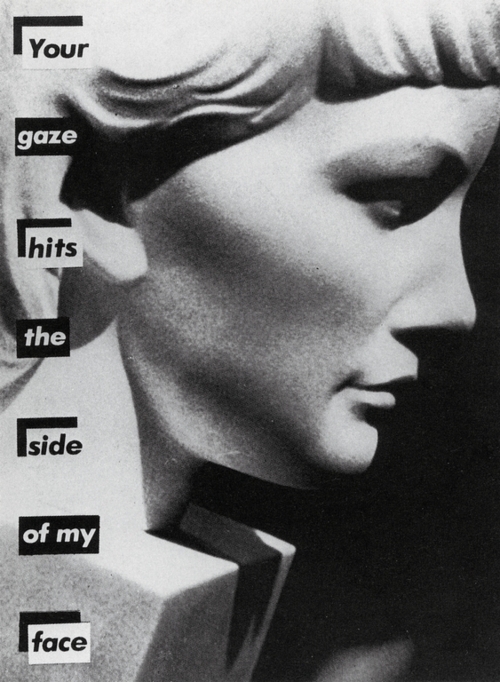
Barbara Kruger - I shop therefore I am (woman artist) (part of minority)
- Lacks any spiritual content
- Defines how we shop, what we buy
- Is it still artwork or has it entered advertising
- Challenging convention (is it mocking in shops?)

Banksy challenges Warhol design
- cheap, tacky style
- is it graffiti, urban art?

- Pop art is of the early forms of Postmodernism
- Are artists wanting to challenge the conventions of art? Is that their sole purpose?


Dr. Parsons, this is me by georg bush, pen and crayon, 2001
- George bush was illiterate - childish imagery portrays that represent the publics opinions on the war in countries


Make effort to create these pieces that serve no real purpose (lightning)

Postmodern aesthetic = Multiplicity of Styles & Approaches
Space for ‘new voices’

Thursday, 13 March 2014

Lecture 8: Photography

- Photography is a form of valuable documentation, a form of evidence to any sort of event.

- Functioning as an evidential role as it records a historical event, a very early image of a general strike, the photographer's position does not make himself clearly visible as he takes it from the back, simply being another man in the crowd. 

- "In many contexts the notion of a literal and objective record of "history" is a limited illusion. It ignores the entire cultural and social background against which the image was taken, just as it renders the photographer neutral, passive and invisible recorder of the scene." - Clarke: 1997:145

- "How the Other Live" is a written and visual account/Study of the tenements of New York by Jacob Riss in 1890, revealing cultural ideologies of ethnicity, poverty and 'the other side'. Riss used this superficially as for tool for social reform, but made a lot of money lecturing to middle classes.


Animation in the Commercial Realm

Auteur Theory in animation

- Animation on one hand echoes and imitates large scale film production processes

- On the other hand it offers possibility for a film-maker to operate almost entirely alone So arguably it is the most auteurist of film practices
- Even at most collaborative it requires cohesive intervention of an authorial presence
 

The Avant-garde
 
‘The French term originally designated that section of an army which marched into battle ahead of the main body of troops (the ‘van’) but has come to be used in both French and English to describe pioneering or innovatory trends in the arts, and especially music and the visual arts. It originates in the work of utopian socialist Henri de Saint-Simon (1760 – 1825) who applies it to the elite of artists, scientists and industrialists who will be the leaders of the new social order" ~ Macey, D (2000), The Penguin Dictionary of Critical Theory

- "Matches: An Appeal" (1899), Arthur Melbourne-Cooper
- "Pochta (Post Office)" (1929), Mikhail Tsekhanovsky   
- "Lloyds TSB"

- "John Lewis Christmas Advert - The Bear and the Hare (2013)"
-  Nintendo - Animal Crossing
- "Mr Fastfinger"

Lecture 7 : Advertising

- Advertising is a tool of capitalism to change established value within society. 
  -It has changed the image of women, from 1950's housewife to sexy glamour models.
- It changes our perception of what we want or even need. It seductively lures us to to buy things.

- The most effective campaigns are those that are long term.

- Advertising often contains sexism and fulfills lots of stereotypes. But although it may be seen as negative, it drives global economies and drives creativity.

- Dali Adverts.

Lecture 6 : Animation

A Historical timeline of Animation:
 

- Animation comes from the Latin word Animare, which means to give life to. The whole process is based on a series of images that give the illusion of movement, by fooling the eye through the persistence of vision.
 

- It all started with sequential imagery from the Egyptians 4000 years ago.
 

- In 1650 Christen Huygens designed the first candle light projector called the Magic Candle. The in 1824 the Thaumatrope was created a victorian toy with two discs on a baton that when spun form a moving image. This was then developed to the Phenakistoscope in 1831which is a flat circle with a slit in that shows a moving image. Then this developed to a vertical drum version called the Zoetrope. Then in 1868 the flip book was made and was patented. The Zoetrope was developed to a Praxinoscope Theater by Charles Emily Reynard, which was a more sophisticated version of the Zoetrope with mirrors.  

- Film developed, which led a major development to animation.


- Norman Mclaren said in 1949: 'Animation is not the art of drawings that move by the art of Movements that are drawn.'
 

- George Melies 1902 made 'a trip to the moon' which has since inspired the Mighty Boosh and The Smashing Pumpkins.
 

- Emile Cole, Fantasmagorie 1908. Often considered the first french cartoon, a hand drawn on film character who morphs into several objects.
 

- Winsor McCay, Gertie the Dinosaur, 1908. First use of compositing. A stilted and very primitive animation, one of the first to use registration marks and key frames.
 

- Winsor McCay, Sinking of the Lusitania, 1918. A short reproduction of the boat crashing made news travel faster, an interpretation of telegraphs coming through, went round in seven days.
 

- Lotte Reiniger, The adventures of Prince Achmed, 1926. A german silhouette fairytale, use of coloured lighting and slick movements.
 

- By 1928 animation had developed it's own language and cartoons became mainstream.
Walt Disney began in 1928 with Steamboat Willie, the first animation to have synchronised sound. Then in 1929 the first animation was created to sound, The skeleton dance was created around the sound.


- Alexander Ptushko, Novvy the New Gulliver, 1929. First stop motion to have tracking shots.
 

- Ladislaw Starewicz, The tale of the fox, 1930. Took ten years to make.
 

- Mark Fleisher, Dizzy Dishes/Betty Boop, 1930. Took Drugs and the nudity got censored. He also created Pop Eye in 1933.
 

- Wills O'Brien, King Kong, 1933. Stop Motion.
 

- Oskar Fischinger, Komposition in Blau, 1935. Fine art /abstract animation.
 

- Toybox, Momotaro vs Mickey Mouse. Japanese propaganda where japanese folk fight off an evil Mickey and American Folk.
 

- Len Lye, Colour box, 1935/1936. Painted directly onto the film stock advert for the post office, advert for the post office.
 

- Disney, Snow white and the seven dwarves, 1937. Rotoscoping, stop motion techniques, and parallax animation. Then Fantasia in 1941 refreshed Mickey Mouse.
 

- Wan Brothers, Princess Iron fan, first animated Chinese feature length that included over 70 artists and took 16 months.
 

- From 1943-1945 Disney produced a lot of propaganda to get Americans involved in the war effort.
 

- UPA, The brotherhood of Man, 1945. Regarding immigrants to america in the 40's portraying All men are equal trying to get rid of racism.
 

- Gerald McBoing, Boing, 1951. Charming Characters.
Neighbours, 1952. Pixelation analergy for the Cold War.


- Chuck Jones, Duck Amuck, 1953, First animation for a character to talk to the audience, very playful.
 

- Animal Farm, 1954.
 

- Animals rebelling against mean farmer, the masses facing the government. Halas and Batchelor worked on it and gained lots of commercial work from this.
Saul Bass man with the golden arm title sequence, Anatomy of a murder 1959.

During the next era Money was thrown at animation at the time. Cinemas Changed and decided they wanted to show more films therefore animation had to be cheaper.

Backgrounds became simpler and things like walk cycles were constantly reused.

Hanna Barbera, Flint Stones.

Bob Godfrey, Do it yourself cartoon kit, 1961, Manic Surrealist Humour.

Zagreb, Ersatz, 1961, about absurdities of the modern age. Simple.

Stan Brakhage, Mothlight, 1963, abstract animations, life, death and emotions.

Ray Harryhausen, Jason and the Argonaughts, 1963.

Osamu Tezuka, Astro Boy, 1963, based on Pinocchio, Early Anime.

Jiri Trnka, the Hand, 1965, Social Commentary.

Chuck Jones, The dot and the Line, a romance in lower mathematics, 1965.

1966 Walt Disney does Gordon Murray, Camber wick green.

Terry Gilliam, Monty Pythons, Flying Circus, 1966.

Oliver Postgate, the clangers 1969.

Richard Williams, Christmas Carol, 1971, not a kids cartoon, a ghost story for christmas.

Ivor Caption, The pinch life Grand Prix, 1975. First one to use a bit of robotics in Armateurs.

Bob Godfrey, Roobarb and Custard, 1977.

Martin Roosen, Watership down, 1979.

Rogermainwood, Autobahn, Music Video, 1979, first computerised animation.

Yuri Norstein, tale of tales, 1979.

Tim Burton, Vincent, 1982,

Don Bluth, the secret of nimh, 1982, used colour photocopies in the animation,

Steven Lisberger, Tron, 1982,

Gerald Scarfe, Pink Floyd the Wall, 1982,

Cosgrave Hall, Wind in the Willows, 1983, also made Dangermouse, very well crafted.

Jimmy Murakami, When the Wind Blows, 1986, Surging Nuclear Holocaust.

Brothers Quay, Street of Crocodiles, 1986, channel four funded,

Joanna Quinn, Girls Night out 1987.

Jan Svankmajer, Alice 1988. Combined techniques such as pixelatioon and stop motion.

Disney, Who Framed Roger Rabbit?, 1988.

Katsuhiro Otomo, Akira, 1988.

Studio, Ghibli, My Neighbour Totoro.

Beauty and the Beast, 1991, computer generated backgrounds.

Barry Purves, Screenplay, 1992, Bedroom Shot.

Steven Spielberg, Jurassic Park, 1993. Dinosaurs, big parks, computer generated stampede scenes.

John Lasseter, Toy Story, 1995.

Dave Brothewick, Secret Adventures of Tom Thumb, 1995.

Aardman, Wallis and Grommit, 1995.

Mamoru Oshii, Ghost in the Shell, 1995.

Lasseter and Stanton, Bug's Life.

Micheal Dudok de Wit, Father and Daughter 2005.

Narayan Shit, Freedom Song, 2000, Indian 2D and 3D.

Jamie Hewlett, Gorillaz, Clint Eastwood, 2001.

Run Wrake, Rabbit, 2005.

Pleix, Plaid Itsu, 2006.

Semi Conductor, Magnetic Movie, 2007.

Marjane Satrapi, Persepolis, 2007.

Henry Selick, Coraline, Stop Motion, 2009.

James Cameron, Avatar 2009, 3D Stereotopic. Reference to Pocahontas.

Cyriak, Flying Lotus, Pretty Boy Strut, 2012.

Dumb Ways to Die, advert for train safety for metro.

Not an exhaustive list, but a list to provide examples of all types of animation through the era.

Lecture 5 : Print

Print - verb 

- To produce (a text, picture, etc.) by applying inked types, plates, blocks, or the like, to paper or other material either by direct pressure or indirectly by offsetting an image onto an intermediate roller.
 

- To reproduce (a design or pattern) by engraving on a plate or block.

- To form a design or pattern upon, as by stamping with an engraved plate or block: to print calico.

- To cause (a manuscript, text, etc.) to be published in print.


“I love a ballad in print a life, for then we are sure they are true.” - Shakespeare

If it is print then it is seen to be true. It is correct. It is factual.

Although this isn't always the case, it used to be as it was such a costly process in the past, items printed were proof read and researched to a high standard. But these days it is not as costly and damages aren't as impeeding. So prints such as the daily mail can get away with printing unfactual information without proper sources. This can also be said about the effect of propaganda, the reason it was so influential during the war is because print before then had all been factual. 

Lecture 4 : Illustration

What is Illustration?
‘…a shining, a spiritual illumination, vivid representation, an enlightening, light up, illuminate, make clear, disclose, explain, adorn, shine light, act of making clear in the mind…’

 
-It is often an addition to something else to add meaning and give light to a message.
-Strategic image making, used within the context of visual communication to convey meaning or concept.


- The history of illustration is as old as the human race from when language evolved. We rely on cave paintings to tell us about the past. They come together to form the first language and first visual literacy and we as people are 'hard wired' to respond to this imagery.

- Illustration is very much the development of signs and symbols into a more picturesque form. The very nature of the aesthetics of an illustration are what make it substantially different to signs and symbols, be it through different choices of media or different ways of line making, that's what makes it different to graphic design.

- The important thing about good illustration is that there is a communication of a message through an original tone of voice, with individuality. Not only can illustrations convey a message but through the medium and mark making they have a chance to convey subtle or abstract sensibilities.

- Illustration exists as a sub genre of the broader art form of visual communication. Examples of how an ilustrator may get comissioned work are through:

- Art director commissions illustration for a newspaper
- Graphic Designer employs illustrator to work on branding project
- Museum curator briefs Illustrator on mural piece for exhibition
- Photographer gets illustrator to design props for set
- Creative Agency buys artwork from Illustrator to use in new branding campaign
- Flagship store employs illustrator to collaborate on visual merchandising for shop window display.

Even though there is a recession there is a demand for illustrators as there key skills can overlap into so many other departments.
'With the inclusion of moving image and the web, there is a massive demand for visual content within contemporary media. Brands, publishers, businesses and products are all desperate to develop deep and genuine relationships with consumers.'

How do we define good Illustration?
- Good illustration is more than illumination. - It can be more than vapid, trend driven cool (cool doesn't exist). - It can be more than twee, pretty embellishment.  It can be functional, have a message and have emotional impact.
- The most important thing when looking at design work is the willingness to form your own opinion.

Tuesday, 4 March 2014

Seminar - Auteurship and the Avant-Garde

Auter = Author

- Film theory associated with French critic Andre Bazin and wrote for Cashiers du Cinema in the 1950s.

- Suggests that great film directors are artists in their own right on a par with great novelists.

- Films made by a true auteur display thematic consistency and artistic development through time.

- Developed in respinse to Hollywood cinema and the criticism that American films are anonymous products of the studio system and culture industry.

- Truffaut - 'A certain tendency in French cinema (1954)' - attacks French tradition in which director is seen as simply adding images to a pre-exisitng literacy scenario.

Auetur theory in animation

- Animation on one hand echoes and imitates large scale film production processes.

- On the other hand it offers possibilities for a film maker to operate almost entirely alone.

- Arguably one of the most auteurest of film practices.

- Even at most collaborative it requires cohesive intervention of an authorical presence.  

-  DISNEY -

-Key figure in creation of art, commerce and industry of animation.

- Seen as epitome for American dream, but also ideologically insound and politically correct.

- With the arrival of Mickey Mouse, Disney withdrew to 'organise the organisation'.

- Winnie the Pooh by AA. Milne - Americanised

- RAY HARRYHAUSEN - 

- Arguably maker of 'B' movies but elevated via his use of effects, which creates a distinctive and signature cinematic style.

- Responsible for character development, formation of story and narrative which would allow characters to come into being.

-
 

Lecture 3 - Type - Production and Distribution

Type - 'what language looks like' 

First true alphabet - Greek
Latin - further development from that
proto-sinaitic alphabet?


 Elementary education Act 1870
Schooling, all kids from 5 - 12


- The Bauhaus 1919 -1933 form vs function
- Helvetica - 'neutral' and 'open to interpretation'
  -Modernism - influential-

- Function dictated form. 25 years is the max time that a design is protected by intellectual property before it lapses
- 25 years later - Microsoft releases own font - Arial (very similar to Helvetica)
- 1990 - print
changed to digital than just analogue
- Gotham typespace -  popular

- Brand, identity, promo etc

Comic Sans created by Microsoft worker in 1994.
IE used from 1995 onwards - uses Arial and CS fonts
Typography - communication method


"There is no single approach within typography that applies to everything" - Shelley Gruendler

Seminar - Genre

- Categorisation of a word
- Often becomes deficient and contradictory
- Useful to think how particular narrative structures work within genres within animation.

Does animation allow for more/worse violence? - 
Should violence in animation be calmed down when the audience is children?
Genre change? Audience change? Does animation make genre crossing easier?
Applying genres - constricting?
Subverting genre?
Udnerlighting - shadows. Obvs hero/villain
Parody  of Jekyll & Hyde with Tom & Jerry (Dr Jekyll and Mr Mouse)
Repetition to emphasise what will happen.


Generic plots;
- Maturation (coming of age/rites of passage)
- Redemption (transition of main - bad to good)
- Punitive (Main character behaving badly and is punished)
- Testing (Willpower vs temptation)
- Education (main character having negative to positive view of world)
- Disillusionment (reverse of education)


Paul Well's Seven Genres of Animation Films:
formal, deconstructive, political, abstract, re-narration, paradigmatic, primal


Lecture 2 - Visual Literacy - The Language of Design

The ability to construct meaning from visual images and type, effectively communicating ideas, concepts and content to different audiences in a range of contexts.

- Affected by audience, context, media and method of distribution.
- Interpreted images of the present, past and a range of cultures.

- Based on pictures than can be read

- Visual communication is made up of presentational symbols whose meaning results from their existence in particular contexts

 
Being visually literate requires an awareness of the relationship between Visual Syntax and Visual Semantics:


-Visual Syntax: The syntax of an image refers to the pictorial structure and visual organisation of elements. it represents the basic building blocks of an image that affect the way we ‘read’ it.
Elements include:

Framing, format, scale, colour, font, stroke, weight, shape, composition, layout, motion, light, rhythm, space, depth, texture, text, words, tone, shade, line, mark, direction, editing, manipulation, simplification, emphasis layering, hierarchy, etc.

- Visual Semantics: The semantics of an image refers way an image fits into a cultural process of communication. It includes the relationship between form and meaning and the way meaning is created through: 

Cultural references, social ideals, religious beliefs, political ideas, historical structures, iconic forms, social interaction, individual experience, recognised symbols, established signs, etc.

Semiotics: 
The study of signs and sign processes (semiosis), indication, designation, likeness, analogy metaphor, symbolism, signification, and communication.
Semiotics is closely related to the field of linguistics, which studies the structure and meaning of language.
Semiotics also studies non-linguistic sign systems, visual language and visual literacy.

Visual Synedoche:
This term is applied when a part is used to represent the whole, or vice versa.

Visual Metonym:
A visual metonym is a symbolic image that is used to make reference to something with a more literal meaning. 

Visual Metaphor:
A visual metaphor is used to transfer the meaning from one image to another.